Alternate jerseys and themed courts are changing the look of playoff basketball, even for iconic teams like the Lakers. The result is a clash between brand identity, nostalgia, and the league's drive to sell more merchandise.
NBA logoLakersalternate jerseysplayoff uniformsbasketball brandingteam identitycourt designmerchandisesports tradition

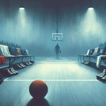
The sight of the Lakers in black jerseys on a black court during the playoffs can feel jarring, even to casual fans who know exactly who is on the floor. For many viewers, that is the problem: the team is still the Lakers, but the presentation no longer looks like the Lakers. The colors, the court, and even the overall atmosphere can feel detached from the franchise identity that made the matchup feel important in the first place.
That reaction is not really about one uniform. It is about the way the league has leaned into alternate looks, special editions, and themed courts until the traditional home-and-away setup feels less central than it once did. In a playoff game, where the stakes are supposed to heighten every detail, some fans want the classic visual language of the sport to do more of the work. Purple and gold should look like purple and gold. Green should look like green. A Finals game should feel like a Finals game before the opening tip.
The complaint is partly aesthetic and partly emotional. Sports uniforms are not just clothing. They are shorthand for memory, continuity, and identity. A classic matchup between iconic franchises carries extra weight because the uniforms help tell the story. When the Lakers and Celtics meet, the colors alone can summon decades of history. When that is replaced by a dark alternate set or a one-off design, the game can lose some of that immediate recognition.
That is especially true for teams with strong visual identities. The Lakers, Celtics, Yankees, Cowboys, and similar brands are not just teams; they are symbols. Fans of that view argue that the league should protect that symbolism instead of treating it as something to be refreshed every season. They see the constant rollout of alternates as a cash grab, a way to sell more jerseys while weakening the visual consistency that makes the sport feel timeless.
There is also frustration with how quickly modern team identity can change. Rosters already turn over constantly, with stars moving from team to team and supporting casts changing every year. If the players are already temporary, some argue, then the brand should be the stable part. When even the uniforms and courts are constantly shifting, the connection to the franchise can feel thinner. The game becomes harder to identify at a glance, and the sense of belonging to a specific team can blur.
Not everyone sees the issue as serious. Some fans dismiss the concern as overreaction and say it is just another version of the old complaints about coaches wearing suits or teams changing logos. Others point out that the Lakers are still obviously the Lakers, LeBron James is still LeBron James, and the game itself has not changed. But for people who care deeply about presentation, those little changes matter. They argue that the details build prestige, and prestige is part of what makes playoff basketball feel larger than the regular season.
The tension is easy to understand. The league wants variety, merchandise sales, and a modern visual style. Teams want fresh looks that can create interest and generate revenue. Fans who value tradition want the sport to preserve the familiar imagery that made them care in the first place. Those goals do not always line up. A black alternate jersey may look sleek in a marketing campaign, but in a playoff setting it can feel like it is competing with the game instead of serving it.
The same argument comes up around courts, where themed designs can make the floor feel more like a promotional backdrop than a basketball arena. A strong court design can enhance a game, but an overly busy one can distract from it. In the postseason, when every possession is supposed to matter, some viewers want the floor to be simple, recognizable, and tied to the team's identity rather than the latest branding experiment.
There is a broader cultural piece to this too. Sports leagues have always balanced tradition against change, but basketball has embraced uniform experimentation more aggressively than some other major leagues. That has produced some memorable looks, but also a sense that the league is willing to trade permanence for novelty. For fans who grew up associating teams with one or two core uniforms, that can feel like a loss.
At the same time, there is genuine interest in the history of basketball uniforms. The materials have changed, the cuts have changed, and the designs have changed. Earlier jerseys were made from different fabrics and required different handling. Equipment managers and team staff used to deal with wet jerseys, rough textures, and even the smell of different aftershaves lingering in the fabric. The evolution of the jersey is part of the sport's history. The issue is not change itself, but how much change is too much when the game matters most.
That is why uniform redesigns and concept refreshes continue to draw attention. Fans may disagree on specific looks, but they are really arguing about what the league should prioritize. Should it lean into nostalgia, or should it keep chasing new merchandise and visual variety? Should playoff basketball look like a timeless championship stage, or like a rotating showcase of alternate branding?
For many longtime viewers, the answer is simple. The biggest games should look like the biggest games. The Lakers should look like the Lakers. The Celtics should look like the Celtics. And if a matchup is important enough to be remembered for decades, the uniforms and court should help make it unforgettable, not fade into the background of the next marketing cycle.


Comments
No comments yet — be the first to share your thoughts.